Design Projects
This page showcases my diverse range of experimental projects, many of which were completed within shorter time frames. These projects serve as a platform for me to explore various mediums and techniques, allowing me to continually expand my skills and creative horizons.

glowskin
Glow Skin is a conceptual branding project exploring visual identity design for a modern sunscreen label. The brief focused on capturing themes of glow, sunlight, and gentle protection through packaging and logo development which I tackled by experimenting with minimal composition, refined typography, and subtle lighting techniques to create a clean and contemporary aesthetic.
The work involved designing a custom logotype and developing a product render to communicate the brand’s core values visually. This project allowed me to explore how simplicity and contrast can convey both softness and sophistication in skincare branding.

Visual Direction & Aesthetic Choices
My approach was guided by keywords in the brief such as glow and sun, which I interpreted visually through strong contrast and restrained colour. A black background set against a white product created clarity and focus, while a faint yellow highlight mimicked a sunbeam, adding subtle warmth. To create a feeling of elegance and softness, I kept the bottle’s shape and layout deliberately minimal, allowing the logo to take focus and the design to breathe with a sense of calm balance.
Logo & Symbolism
When designing the logo for this project, I aimed for something clean and understated. By fusing the letters “L” and “K,” I created a subtle sparkle-like shape, which serves as a quiet visual reference to the brief’s themes of glow and radiance. I used a typeface that was clean but slightly stylised, giving the logo a soft, distinctive edge without making it feel clinical or generic.


Challenges & Solutions
One of the biggest challenges in this project was setting up the lighting in Blender, as I was still unfamiliar with the software. Initially, the lighting either flattened the product or made it look cheap and plastic-like. I overcame this through experimentation, such as changing the floor to a mirror-like surface to help bounce light naturally and make the product the focus, or placing a soft yellow light behind it to simulate sunlight. These changes added depth and atmosphere while preserving the black background I wanted for a minimal, high-end look.


While this was a fast-turnaround project, I’m pleased with how the product turned out visually. I’m still unsure whether the luxury-inspired aesthetic perfectly matches the brief’s youthful tone but I believe it could appeal to young people who value aspirational branding. In the future, I’d like to explore alternate directions that might feel more playful or warm, while still preserving the clean aesthetic.

DNM GEN
REDEFINING SUSTAINABLE FASHION THROUGH BOLD MINIMALSIM
DNM GEN is a sustainable denim brand built around the idea of giving discarded materials a second life through upcycling. The brief called for a bold, modern, and innovative identity, which I approached by avoiding clichéd symbols like denim textures or recycling icons. Instead, I explored how a small, thoughtful design decision such as altering a single letterform could convey the brand’s values in a more subtle and modern way. This project gave me a chance to experiment with minimal yet impactful visual language while staying true to the themes of sustainability and reinvention.

Logo Concept
The DNM GEN logo was designed to reflect the brand’s forward-thinking and innovative spirit. I kept the wordmark clean and minimal but made a deliberate decision to alter the final “E” by switching it to a different typeface. This subtle change acts as a visual metaphor for upcycling, symbolising how something existing can be reworked into something better. I wanted to avoid predictable visual cues often associated with sustainability, such as the recycling symbol, and instead communicate the idea of transformation through more understated means. The result is a bold yet refined logo that quietly disrupts without relying on clichés.

Clothing Tag
The tag design was kept intentionally simple to maintain focus on the brand’s visual identity. One side features a solid indigo blue, tying directly into the deep tones of denim, while the other side highlights the altered “E” from the logo. By isolating this element, I emphasised the part of the branding that makes it memorable and conceptually strong. The tag reinforces the brand’s identity in a quiet but confident way through small, intentional design choices.
Problem Solving & Design Choices
A key challenge in this project was finding a way to visually communicate sustainability and innovation without relying on predictable or overused design elements. I deliberately avoided denim textures, fabric patterns, or recycling symbols, as those are often the go-to visuals in projects involving upcycling or eco-conscious fashion. Instead, I wanted to take a more thoughtful, pared-back approach that aligned with the brand’s focus on boldness and innovation. By stepping away from these typical cues, the goal was to create something that stood out from the rest while still feeling intentional and relevant.
Another consideration was making sure the work felt visually resolved and professional, without overcomplicating the designs. Since the brand materials, such as tags and posters, had to be functional in real-world contexts, I focused on clarity and restraint. Most of the problem-solving came down to trusting small, meaningful decisions. For example, altering the "E" in the logo was a subtle way of reinforcing the concept of reinvention without making it feel forced. Keeping the layouts tight and allowing that one detail to carry weight helped me strike a balance between minimalism and impact. Ultimately, the project became an exercise in showing how simplicity, when applied with purpose, can still speak volumes.

Promotional campaign concept highlighting DNM GEN's bold and sustainable identity.
The poster was an opportunity to push the visual identity further while maintaining cohesion with the rest of the branding. I used a deep indigo and white palette to stay rooted in the denim theme, while adding small touches of pastel for contrast and visual interest. Rather than relying on fabric textures or obvious references, I focused on bold typography and clean composition to keep the message clear. The goal was to capture attention while staying true to the brand’s modern and stripped-back aesthetic.
Poster

Reflection
This project helped me think critically about how branding can suggest transformation without being overt. I’m pleased with how the logo and supporting visuals express DNM GEN’s values without relying on expected visual shortcuts. In future iterations, I would like to explore how this identity could stretch further — maybe across digital or motion-based applications — while still maintaining its quiet strength and clarity.
Growth:
The Dark room
The layout design of a room I made for an exhibition called Growth which represents the growth and progress I made as a student during my 3 years in university. The exhibition has a total of 3 rooms, each representing a stage of growth and the one underneath is the layout design of the second one, called "The Dark Room" which is a space where fellow people get to project their digital work and videos into a dark room for a sensory experience.


The purpose of this room mockup is to illustrate the idea that individuals can have the freedom to display their work on any kind of surface such as the floors, walls or objects for a more unique experience.

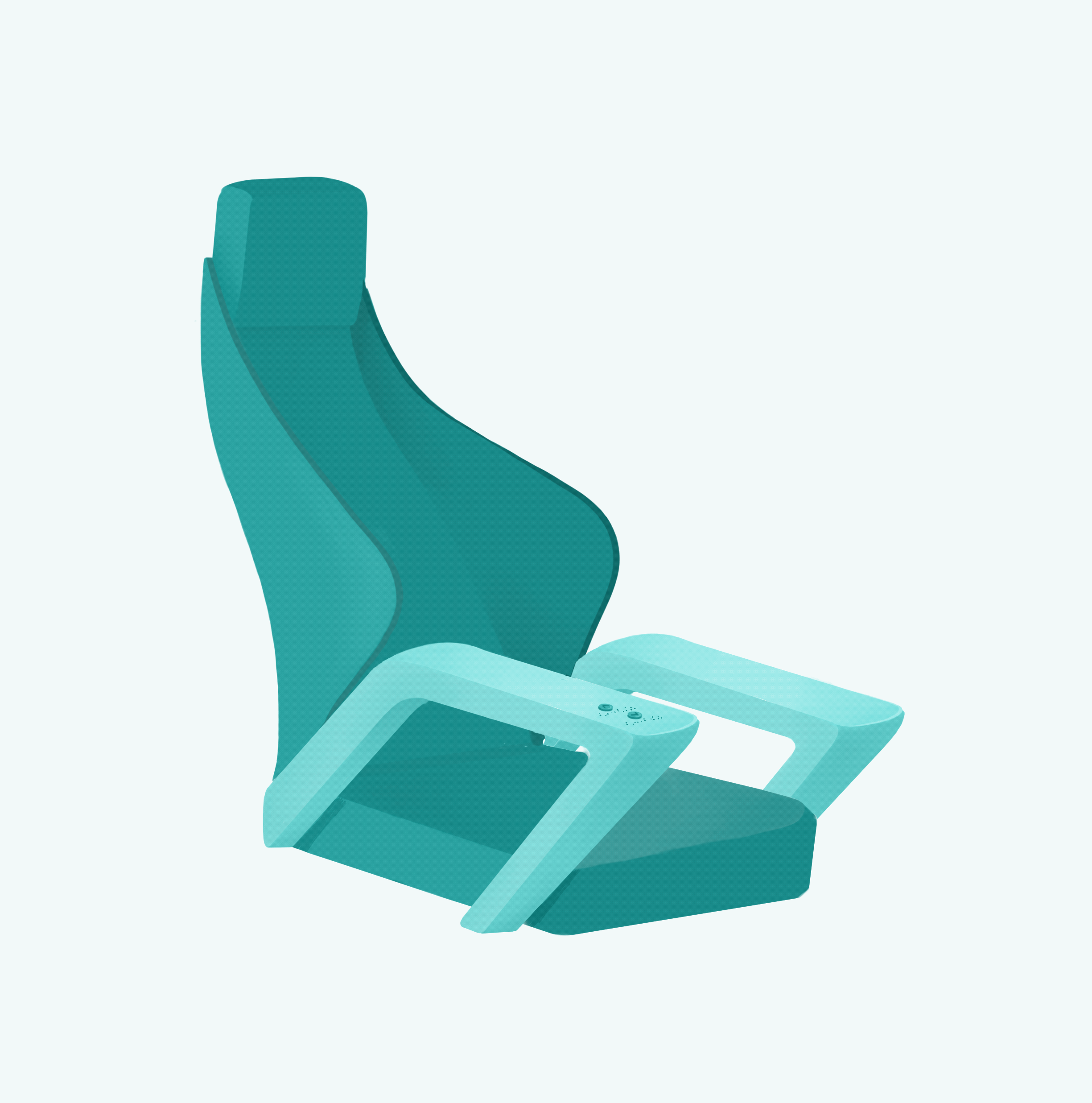

SAV SEAT DESIGN
The SAV project (Shared Autonomous Vehicle) looks into ways of providing a safe ride sharing experience within self-driving vehicles by implementing seat designs that ensure privacy for the passenger. Therefore, as a way to tackle this issue, I designed a seat that has a retractable hood which can be activated at passenger’s will.
The seat also includes a curved backrest for support and a braille by the armrest near the buttons for accessibility. I initially presented this idea though a 2D animation, however I thought it would be fun to also try out mediums outside my confront zone; therefore, I presented the same design through a 3D animation that I made using blender while keeping the 2D elements of the seat.
